Design
Photography
Illustration
Videos
Street Art
Typography
Architecture
Motoring
…
Design
Photography
Illustration
Videos
Street Art
Typography
Architecture
Motoring
…
Advertise
-
Follow:
FB
t
P
S
G+
rss
Calligraphy
April 28, 2014
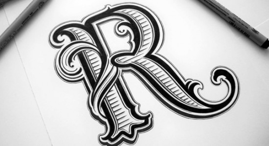
Hand Lettering by Mateusz Witczak
January 28, 2014
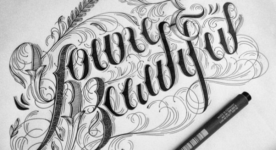
Hand lettering and Typography by Raul Alejandro
January 23, 2014
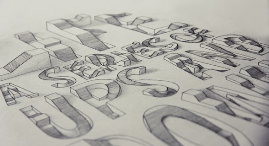
3D typography by Lex Wilson
October 24, 2013
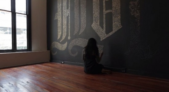
Flourish Typography Project by Dana Tanamachi
September 2, 2013
Hand lettering – Mateusz Witczak
July 4, 2013
Pine Typography by Cody Petts
September 7, 2012
Illustrations by Hellovon
October 6, 2011
RIP Steve Jobs
1
2
3
4
»
Categories
Design
Photography
Illustration
Videos
Street Art
Typography
Architecture
Motoring
…
Archives
2016
2015
2014
2013
2012
2011
2010
2009
Interesting Links
(The) Refractions
Amkashop
Artskills
Daim
From up North
Ryan McGinness
Supporting
Best inflatable hot tubs
Cabin Hand Luggage
Designer watches
Henry Hoover
Inflatable
Shock Absorber
Follow us...
Your favourites
Today
This week
This month
All time